Fall '23
UE Group
Redesigned the website of a nonprofit company in rural California
.png)
Redesigning a Nonprofit Website for Accessibility and Low-Tech Literacy Users
At-a-glance
In rural communities, access to support often depends on clear, usable digital tools. In this nonprofit redesign project, We helped reimagine a website that supports widows, volunteers, donors, and founders, many of whom have limited experience with technology. Through interviews, competitive research, wireframing, and iterative prototyping, our team designed an experience that prioritizes clarity, consistency, and multiple points of access, making it easier to request help, donate, and manage information without overwhelming users.
Industry
Accessibility & non-profit
Role
Research
Conceptualization
Design
Timeline
Fall 2024
5 months
Team

Kevin
Kim

Dajanae
Gottlieb

Hope
Jang

Brooke
Miller
My Contributions
-
Performed thorough research on successful small businesses
-
Conducted interviews with small business owners, widows, and small nonprofits
-
Conducted competitive analysis for nonprofits
-
Collaborated during brainstorming sessions to generate designs
-
Designed detailed wireframes
-
Developed interactive prototypes
-
Conducted user testing on prototypes and iterated based upon suggestions
Problem breakdown
UE Group is a UXD consulting company. They tasked us with redesigning the website of a small, nonprofit company named Widows in Need (WIN)
What is WIN?
-
WIN is a fledgling nonprofit focused on the unique needs of widows in rural California
-
Many services assist widows with their emotional needs, but physical needs often fall through the cracks
-
Chopping firewood or yard work in a rural area may become difficult when a spouse passes
-
WIN was formed with the needs of rural widows and widowers in mind, and with the goal of facilitating support from the local community.
Problem Overview
Our team was tasked with redesigning WIN’s website. We decided to create a simple design that is accessible to all levels of tech literacy due to the possibility that rural widows may not have technological experience.
We identified the following issues for this site:
-
Aesthetics
-
Inconsistent branding, irrelevant images
-
-
Lack of automation
-
For a widow to make a request or for a user to make a donation, they needed to directly call one of the founders who would then write down the request or donation.
-
-
Faulty donation button
-
Users were unable to give donations through the website
-
-
Irrelevant images
-
The website had a slideshow of obvious stock images that were often blurry
-
-
Logo
-
The logo was small and hard to discern
-
-
Inability to request help
-
The website only showed information about the services provided and a phone number
-
Widows could only request for help by calling one of the founders
-
User Group

This project targeted multiple user groups who utilize the website, including
-
The founders of WIN who utilize the website to organize their data
-
Widows/widowers who use the website to learn more about the organization and request help
-
Volunteers who use the website to
-
learn how they can help through donations or physical help
-
sign up to be registered on their volunteer list
-
We learned that we needed to be designing for a lower-tech literacy user group. We also would have to design the website to ensure all three different user groups would be able to perform the actions necessary in an easy and clear manner.
Current Experience
What were the pain points that we solved?
Old Website
The old website had issues with images, buttons, and overall design. It did not function in a way that helped WIN connect with widows in need of help. Additionally, the founders did not have login access to the website.
Small illegible logo
Blurry stock images

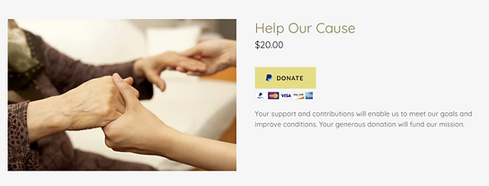
Broken donate button
Whole gallery is stock images — feels impersonal & implies a lack of experience

Our team sought to redesign WIN’s old website to make it more usable so that widows/widowers, volunteers, and donors can interact with WIN online. This in turn would also lighten the burden on the founders when handling various requests through phone calls and paper documentation.
Research
What are best practices when desiging a page such as this?
What are other nonprofits doing?
We realized that we needed to research successful small businesses and nonprofit organizations in order to redesign their website and process. We did this by conducting many different competitive analyses.
We found several common themes to how nonprofits organize and convey information.
Easy navigation is critical to cater for older demographics with lower tech literacy
Having intuitive organization allows nonprofits to be successful even after having an influx of information to sort
Having an aesthetically pleasing layout will encourage users to stay on the website and donate
Alternative
Directions
From our research, we found a multitude of directions we could then go into
-
Focus on the aesthetics of the site
-
Create intuitive navigation and multiple points of access
-
Develop an organizational tool for the founders to sort out volunteers and those who need help
We found that the current organizational tools for nonprofits are overly complicated and have a steep learning curve.
We decided that instead of adopting something that would take time for them to learn, we felt it would be best for the sponsors to utilize Google Sheets and Excel. This also means that the sponsors would develop this on their own and link it to the website themselves.
Below are the main aspects we focused on when creating the designs.
Wording and layout is consistent
Clear indication of who each page is for
Easy for users to read
Multiple points of access
Aesthtically pleasing
Final Designs
How did we turn our findings into a cohesive design? Below, you will see the different pages of the redesigned website.


Important elements to note
-
There are multiple ways to access each page
-
Every page clearly explains what it is for and who it is intended for
-
Wording and layout are consistent
-
Everything is easy to read
These are key features we included that we found to be particularly important from our research and user interviews. These also were resolved the pain points that we found.